What is responsive website design?
Responsive website design is an approach to website design that makes web pages render well on any device and screen size. A responsive website automatically adapts its layout to the viewing device, whether it’s a desktop computer, a laptop, a tablet, or a mobile phone.
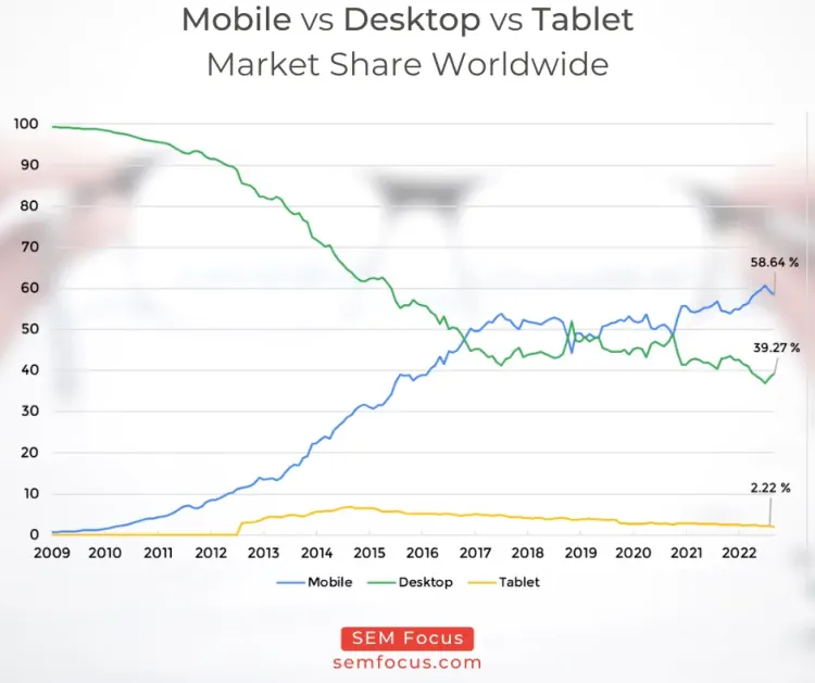
Responsive website design has become increasingly important as the number of mobile phone users has grown and continues growing. According to a 2022 report by statcounter, 59% of all U.S. digital media time is now spent on mobile devices. That number is only going to grow, so it’s important that your website be ready for it.
A responsive website is designed to work well on all devices, regardless of their screen size. This means that no matter what device a visitor is using, your website will always look good. Responsive website design is also good for SEO, since it ensures that your website will be properly indexed by search engines.
How does responsive website design work?
Responsive website design is a web design approach aimed at crafting sites to provide an optimal viewing experience—easy reading and navigation with a minimum of resizing, panning, and scrolling—across a wide range of devices, from desktop computer monitors to mobile phones.
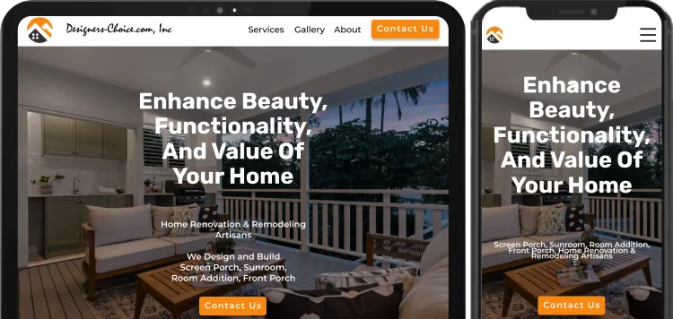
A responsive website design will respond to the size of the device it is being viewed on. The layout of the website will change depending on the size of the device. So, if someone is viewing the website on a desktop computer, the website will have a wide layout. If someone is viewing the website on a mobile phone, the website will have a narrower layout.
This can be done in a number of ways, but the most common is to use Media Queries to change the layout of the website based on the width of the screen.
Why is responsive website design important?
As technology advances and more people access the web using mobile devices, it is increasingly important that your website is responsive – that is, it adapts to the size of the screen it is being viewed on. A responsive website will look good and be easy to use on any device, from a desktop computer to a smartphone.
A responsive website is important because it ensures that your website is accessible to as many people as possible. If your website isn’t responsive, it will be difficult to use on a mobile device, and many people will simply leave your website. As more and more people access the web using mobile devices, it is essential that your website is responsive to ensure that you don’t lose out on potential customers.
A responsive website is also important for search engine optimization (SEO). Google now uses mobile-friendliness as a ranking factor, so if your website isn’t responsive, it will be ranked lower in search results than websites that are.
So why is responsive website design important? There are a number of reasons, but the most important one is that a responsive website is accessible to more people and is more likely to be ranked higher by search engines.
How do you create a responsive design?
There are a few techniques you can use to create responsive designs. One popular technique is called “media queries.” With media queries, you can use specific CSS rules to change the appearance of your website based on the size of the screen. For example, you can use media queries to make your website narrower or wider when it’s viewed on a smaller screen. You can also use media queries to change the font size, the spacing between elements, and other aspects of your website’s design.
Here is an example how we can customize the size of H1 header tag based the device user is using:
<style>
h1 {
font-size: 2rem;
}
/* Small devices (landscape phones) */
@media (min-width: 576px) {
h1 {
font-size: 3rem;
}
}
/* Medium devices (tablets) */
@media (min-width: 768px) {
h1 {
font-size: 3.5rem;
}
}
/* Large devices (desktops) */
@media (min-width: 992px) {
h1 {
font-size: 4rem;
}
}
/* Extra large devices (large desktops) */
@media (min-width: 1200px) {
h1 {
font-size: 4.5rem;
}
}
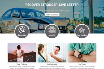
</style>One of the most noticeable change when viewing website on mobile and desktop is the menu. On a desktop computer or tablet you typically see full menu at the top, however when you view the same website on mobile device you only see a hamburger menu button:
You have the option to custom code responsive design stylesheets (CSS) or you can use one of the most popular css frameworks out there.
Our most favorite one is Bootstrap – HTML, CSS and JS framework developer by Twitter. With version 5 it no longer requires separate jQuery included in your website. This reduces the size number and size of external needed to run your website.